The Very Good Whisperer
By: Burgo Fitzgerald
John Morgan was the designer's designer. He worked with artists, architects, bishops and publishers, moving easily between the dimensions of a footnote and those of a public building. His work had a particular quality of attention.
Morgan died at his home in Chadlington, Oxfordshire, on 2 September 2025, aged 52. He left behind a body of work embedded throughout British cultural life. It included Common Worship for the Church of England, identities for architects and galleries, lettering for Tate Britain, the graphics of the 2012 Venice Architecture Biennale, the art direction of AA Files and ArtReview, and books made with Edmund de Waal, Helen Marten, Christian Marclay, and Juergen Teller.
The esteem in which Morgan was held could be obscured by his modest manner. ArtReview described him as “one of the most celebrated and influential typographers and graphic designers of his generation”. The Kunstakademie Düsseldorf placed him “among the most talented typographers and typographic artists of our time”. Derek Birdsall called him a master.
An Eye profile published in 2012 found Morgan at a revealing point in his career. He was known as a restrained and unusually exact typographer, though the work could also be theatrical, disruptive and very large. Morgan saw no contradiction. Typographic detail and the grand gesture were different means of creating what he called atmosphere.
“Atmosphere is a problematic and woolly word,” he said, “but it’s the best description of what I aim for in my work.” He compared it to entering a building and feeling that the conditions had changed. A book, he believed, could produce the same sensation.
A USEFUL SEVERITY
Morgan was born in Galgate, Lancashire, in 1973. His father was a biochemist with an enthusiasm for stationery who sent his son letters addressed in a different typeface each week, complete with historical credits. The family home was, Morgan recalled, open and critical. John Berger’s Ways of Seeing was among the few books there connected with art or design.
He arrived at the University of Reading in 1992. Typography there was taught through history, theory and the practical consequences of every decision. Michael Twyman had deliberately separated graphic communication from the expressive culture of the art school. While the art students sat smoking and painting, Morgan remembered, the typography students worked furiously towards deadlines.
Paul Stiff supplied what Morgan called “severe, useful criticism”. He once dismissed a student project as resembling an in-flight meal. The remark was funny but the lesson serious. Orderliness alone did not amount to thought. A page could be tidy and still be wrong.
After graduating in 1995, Morgan joined Derek Birdsall’s Omnific studio. It was a second education, conducted through authors, printers, production schedules and the physical behaviour of a page. Morgan admired Birdsall’s ability to settle every detail and then add one beautiful thing that made the object particular.
When Morgan established his own studio in 2000, he carried with him both traditions. Reading had taught him historical scrutiny. Omnific had given him the direct editorial judgement of the atelier.
A PRAYER BOOK FOR USE
The project that first established the scale of Morgan’s ability was Common Worship. Begun with Birdsall at Omnific and taken into Morgan’s new studio with his mentor’s blessing, it would be used by more than a million Church of England congregants each week.
Morgan and Birdsall rejected the visual density associated with the traditional prayer book. They introduced open pages, warm ivory paper and a clear hierarchy in Gill Sans. Red pages appeared “for joy”. Bold type indicated passages spoken by the congregation; regular type belonged to the person presiding. The cover transformed the words Common Worship into the arms of a cross.
Its refinement began with decidedly earthly questions. The paper had to survive repeated handling but remain thin enough to keep the book light. The type had to work in the dim light of old churches. Prayers had to remain on a single page so that a congregation would not interrupt a recitation with the sound of turning paper.
The bishops were exacting, which suited Morgan. He did not regard their requirements as interference with the design. They were the design. Authority would not come from a clever cover or a signature flourish but from the accumulation of settled decisions. It was present in the weight of the volume, the order of a service and the ease with which a reader found the next line.
Morgan worked with the Church of England for more than a decade, adapting the system for different formats and occasions. When the completed first volume was presented to Queen Elizabeth II at Westminster Abbey, he had to buy his first tie.
THE NEGLIGIBLE DETAILS
Birdsall called Morgan “a master” of what the theatre and opera director Jonathan Miller termed “negligible details”. The phrase did not mean that the details were inconsequential. They were small enough to escape ordinary notice while decisively changing the character of an object.
Birdsall’s example was Morgan’s edition of Bram Stoker’s Dracula for Four Corners Books. Because the novel is assembled from diaries, letters, newspaper reports and other documents, Morgan assigned different typefaces to its principal narrators. The book’s many voices became visible before their differences were consciously registered. Its page tops were dyed blood red, a theatrical flourish made more effective by the discipline surrounding it.
The project condensed Morgan’s method. Research established the structure. Typography clarified the text. Production gave the idea physical consequence. Then came one beautiful thing.
The same intelligence appeared differently across the Four Corners Familiars series, which invited artists to respond to classic works of fiction. Morgan did not impose a template and pour each novel into it. The structure was stable enough to hold the series together but loose enough to accommodate the particular relationship between artist and text.
Each book was permitted its own temperament. Some presented an artist’s work as a sequence of plates. Others allowed the intervention to spread into the typography, binding and architecture of the volume. They belonged together without resembling products lined up on a shelf.
BOOKS ARE DIFFERENT TERRITORY
In 2004 the studio moved into the former clerks’ offices above Platform 1 at Paddington Station. Morgan lived in Oxfordshire and his train arrived at the terminus. Locating the practice there was, he said, a “design solution”. It was also a suitably Morgan-like arrangement, a handsome Victorian room chosen according to the timetable.
Books remained at the centre of the practice because they brought language, sequence, material and time into a single object. Morgan once said that good design was a branch of editing. Editing, in this sense, was not simply the removal of material. It meant establishing relationships.
A designer decided how a caption met an image, how a typeface altered the temperature of an argument and whether a historical reference remained alive or had hardened into pastiche. The questions extended to paper, binding and reproduction. The way a book opened and rested in the hand mattered as much as the arrangement of a spread.
Morgan worried about whether books and catalogues deserved to exist at all. What was the purpose of a large photographic monograph when its images could be found online? Why produce another art catalogue that nobody would read? The question came before the design. There had to be something worth reading, handling and keeping.
“Books aren’t products,” he said. “It’s a different territory.”
AN EDITOR IN THE DESIGNER’S CHAIR
Morgan’s redesign of AA Files demonstrated what he meant by design as editing. The Architectural Association’s journal had acquired the smooth, official appearance of an annual report. He recast it as a quieter and more literary publication, one intended to remain on a shelf and be read again.
Fred Smeijers’ Arnhem Blond carried the long texts, while changing display faces and large initials introduced a more unruly note. The journal could accommodate scholarship, archival material, criticism and visual essays without pretending that they were all the same kind of content. Its quietness was structural rather than decorative.
Morgan brought related judgement to ArtReview. Before hiring him, the magazine’s editors had looked “in envy” at his work for David Chipperfield Architects, 6a architects, Raven Row, AA Files and Four Corners Books.
His 2013 redesign stripped away the glossy conventions accumulated during the 1980s and 1990s and reconnected the magazine with the intellectual seriousness of its postwar origins. The studio continued handling its daily design until 2022, establishing a visual atmosphere that the magazine’s own designers could maintain after Morgan stepped back.
Even his instructions possessed the economy of his pages. One email read, “Just needs a tighter crop perhaps. Just sprained my ankle. I’m on codeine and booze, over and out.”
The line dispels the idea of Morgan as a bloodless perfectionist. The work was controlled, but the man was funny, curious and alert to absurdity. Precision was not severity for its own sake. It made room for pleasure.
AT WALKING SPEED
Morgan’s relationships with architects changed the scale at which he worked. Identities for David Chipperfield Architects, 6a architects and Raven Row were joined by exhibition graphics, public artworks and a new system of signs for Tate Britain. Typography moved from the page into stone, brass, corridors and façades. It had to be read while walking, from a distance and among other things.
For Tate Britain, Morgan drew a typeface from an 18th-century precedent and had it fashioned in brass at the entrance. Elsewhere he reduced the presence of signs, giving the art and architecture more room. The identity did not announce itself continuously. It established the conditions in which the museum could be encountered.
The 2012 Venice Architecture Biennale presented the same problem at the scale of a city. Morgan studied Venice’s nizioletti, the hand-painted street names set within irregular white rectangles on brick and plaster. The signs, he observed, do not prevent visitors from becoming lost. They allow them to become lost elegantly.
His studio developed a stencil alphabet from this Venetian vernacular and carried it through four publications, exhibition rooms, posters, bridge banners and vaporetto wraps. The graphic identity did not simply represent Venice. It entered the city’s visual language and began to mingle with it.
The project won the graphic design category of the Design Museum’s 2013 Designs of the Year. It was Morgan’s third consecutive nomination. The Familiars series had been nominated in 2011, followed by AA Files in 2012.
Morgan called his working relationship with architects “critical compliance”. The designer supported the larger undertaking while preserving enough independence to question it. David Chipperfield described the benefit differently. Architecture required moments when someone could clarify the proposition. Morgan earned that trust because his decisions were precise.
“If everyone shouts it’s a good idea to whisper,” Chipperfield said. “And John is a very good whisperer.”
A REPUTATION WITHOUT PERFORMANCE
Jonathan Bell, who worked with Morgan on the small design-history journal Things, recalled that Morgan gave its modestly funded pages the same concentration he brought to major institutional commissions. Wallpaper selected him as one of the world’s 20 best graphic designers and later described his “rare typographic sensibility”.
Bell also remembered someone humble, friendly and endlessly inquisitive, “the very opposite of a superstar designer”.
Morgan belonged to a period in which designers were increasingly expected to become visible personalities, explain proprietary methods and perform a recognisable style. He built his reputation differently. When a project succeeded, the book, institution or exhibition became more itself.
The identity for David Chipperfield Architects demonstrated the confidence of that position. Its brand book began with the instruction, “The first guideline is to work with a good designer.” It was both a joke and a serious objection to the fantasy that a manual could replace judgement.
Morgan’s systems possessed coherence without the deadening uniformity of conventional corporate design. They could absorb changing material and other voices because he did not require every object to advertise its author. His presence was often most apparent in what had been removed.
HISTORY WITHOUT NOSTALGIA
Morgan knew the history of typography too well to use it as decoration. When he and Adrien Vasquez designed new stern lettering for the 2015 repainting of HMS Victory, they discarded an anachronistic treatment introduced during an earlier restoration.
Working with the typographic historian James Mosley and studying contemporary naval paintings, they reconstructed lettering appropriate to Nelson’s flagship. Phil Surey painted the letters by hand. The result looked convincing because it emerged from evidence rather than a general idea of the past.
The project balanced scholarship with public spectacle. The letters were historically grounded but also had to hold their own on the stern of one of Britain’s most recognisable ships. Morgan’s negligible details had become several feet high.
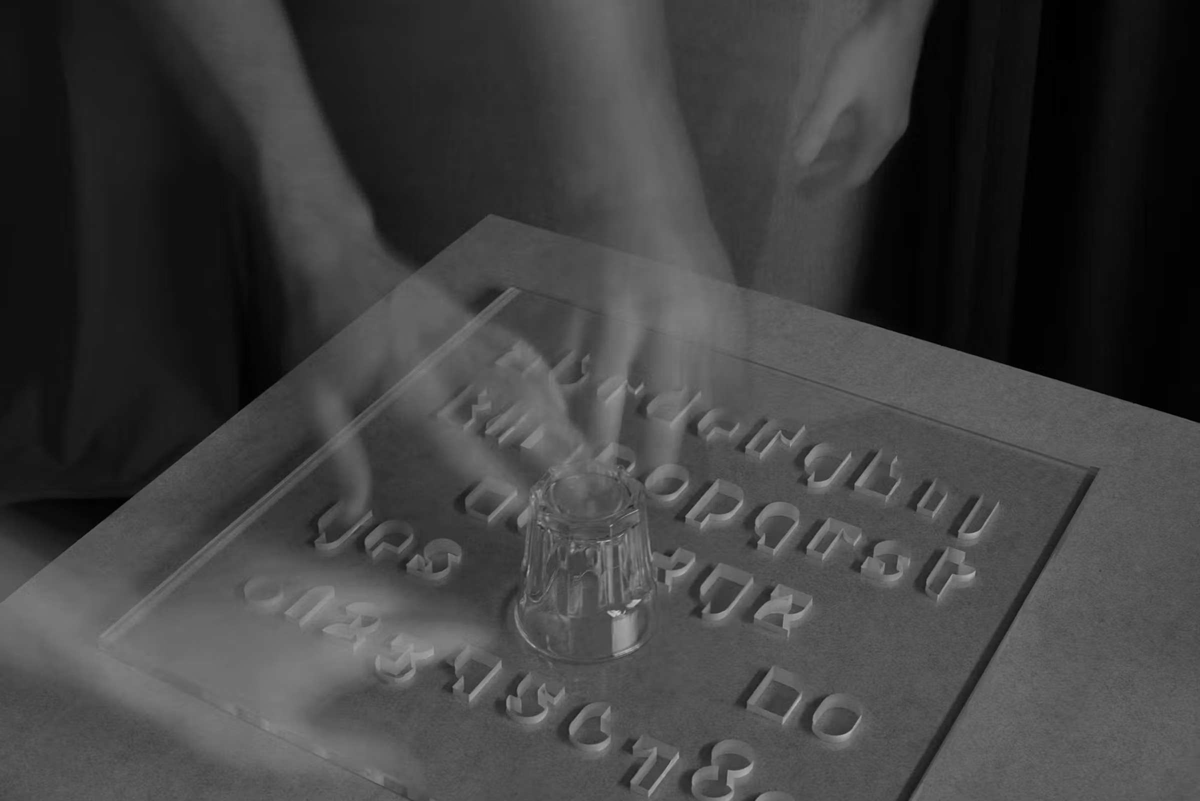
Two years later Morgan and Vasquez founded Abyme, a digital type foundry that also sold artists’ editions and objects derived from studio projects. Typefaces, printed garments and a glass spirit board occupied the same territory. Abyme treated letters not as neutral software but as cultural material capable of moving between archive, publication and street.
Tradition, Morgan argued, was not a dirty word. Historical knowledge gave a designer more freedom, not less. It allowed conventions to be understood, tested and departed from deliberately.
THE TYPOGRAPHER AND THE ARTIST
The same attitude shaped Morgan’s teaching at Central Saint Martins, Reading and, from 2016, the Kunstakademie Düsseldorf, where he became professor of Design, Typography and Book Art.
At Reading, where the students possessed technical control but sometimes lacked atmosphere, Morgan pushed them towards larger gestures. At Central Saint Martins, where gestures came more readily, he taught the detailed setting of telephone directories.
His ideal designer combined the typographic precision of Jan Tschichold or Hans Schmoller with the ability of artists such as Martin Kippenberger and Hans-Peter Feldmann to apprehend an entire situation. The negligible detail and the unruly whole had to coexist.
Morgan became one of the Kunstakademie’s most popular professors. The academy described the publications he designed there as “typographic works of art second to none”. Its tribute also identified the character behind them. Morgan approached another person’s work with artistic empathy, boundless interest and “an insatiable hunger for knowledge not unlike that of a scientific researcher”.
He did not arrive with an answer. He studied a subject until it disclosed what kind of design it could bear.
MAKING BOOKS MORE BEAUTIFUL
Edmund de Waal, one of Morgan’s longstanding collaborators, distilled his achievement into six words.
“John made books more beautiful.”
Beauty in Morgan’s books was never an applied finish. It could reside in the pace of a sequence, the resistance of a paper, an unexpected typeface, the colour along a page edge or the way a volume lay open in the hand. Printing and binding were not delivery mechanisms for the design. They were part of its language.
That is why his books are difficult to understand through reproductions alone. They ask to be picked up, opened and read. Their design unfolds in time. A page that appears almost empty may acquire its force from the density that preceded it. An extravagant detail may work because the preceding hundred decisions were restrained.
Morgan’s own Usylessly, published in 2021, carried this understanding to an eccentric conclusion. The book examined the first 1922 edition of James Joyce’s Ulysses as a physical object. Morgan considered its blue cover, dimensions, paper, printing history and bulk rather than approaching it primarily as literature.
His reconstruction contained 736 pages, of which 672 were blank. It reproduced the presence of the original volume while withholding the text that had made it famous. The result was at once scholarly, affectionate and absurd, a portrait of a book emptied of its novel.
In 2025 Morgan established Ten Thousand Angels Press and completed a second edition shortly before his death. He also finished Baskerville’s Teardrop Explodes, a selection of 31 books that had served as personal muses. They were chosen less as monuments of correct design than for their appearance, associations, accidents and attachments.
Together they formed an oblique self-portrait through other people’s books. The selection embraced the refined and the ordinary, confirming Morgan’s appetite for high and low culture and his suspicion of impeccable taste when it became a constraint.
A STANDARD OF ATTENTION
Morgan once said that his aim was to design for readers. His finest work honoured their intelligence without making them conscious of every accommodation made on their behalf. The typographer receded, but his judgement remained everywhere.
His work was quiet, but never timid. Its restraint was evidence of appetite under control. He knew that a gesture mattered only when the conditions around it had been properly established.
His legacy is present in institutions, magazines, ships, galleries and books. It also survives as a standard of attention. Read before arranging. Understand the object before styling it. Respect the person who will use it. Settle the details, then introduce one beautiful thing.